squared dotCases / MamutTV

Subscription Streaming Service

MamutTV would be a revolutionary international platform for watching videos and series, with the possibility of integration between several services, including clouds and personal servers for private and exclusive users.

I want to know more about
System development
The project was born from the client's desire to unify - on a single platform - a wide range of TV programs, films and documentaries at a fair and competitive price. Following new trends in IPTV applications, the platform would allow the viewing of videos stored in a cloud, offering a user experience similar to popular streaming services.

Complete solution

MamutTV is one of the most complete naming, visual identity and interface design projects that we have ever developed. Our design team dove into research and constant client meetings. Below we tell you a little bit of everything that was done.

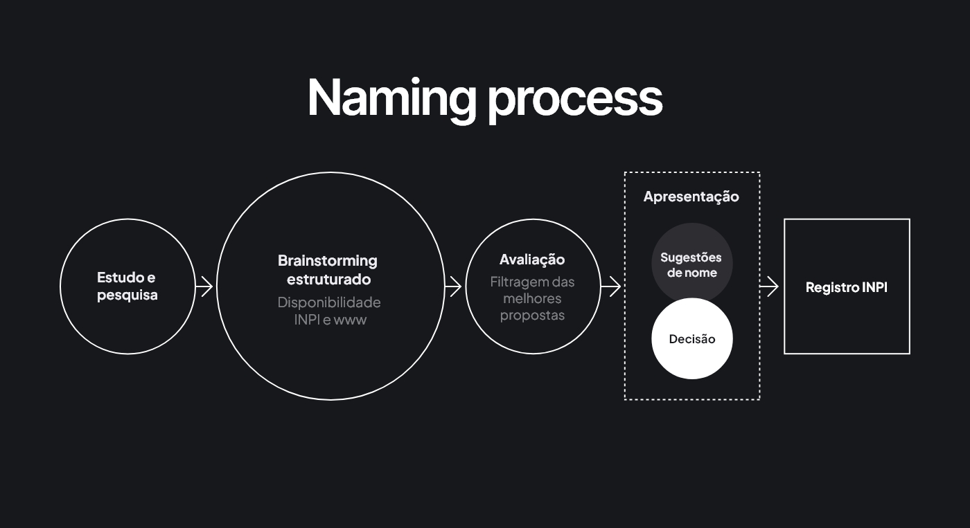
Naming is serious business

In order to have good ideas, you first need to have many ideas. We researched and tested hundreds of words until we reached just 5 in the presentation to the client. The name should match the sound and phonetics of various languages (English, Latin languages, etc.) as well as have a simple spelling. Several other criteria were also listed, such as being a short and easy-to-memorize word.

The symbolism of the Mammoth

The mammoth is one of the largest mammals that ever existed and is from the same family as elephants. Its main characteristics were: sociability, intelligence (cooperation) and communication (through sounds and body signals). The mammoth's size and presence still remain in our unconscious. Contemporary manifestations, such as animated films and statues of team mascots are a clear sign of that. With this in mind, the company's goal was to associate the name with the extensive catalog of films, series and documentaries

Other keywords that can be associated with our mammoth are: immensity, memory, greatness, family. 

Visual identity

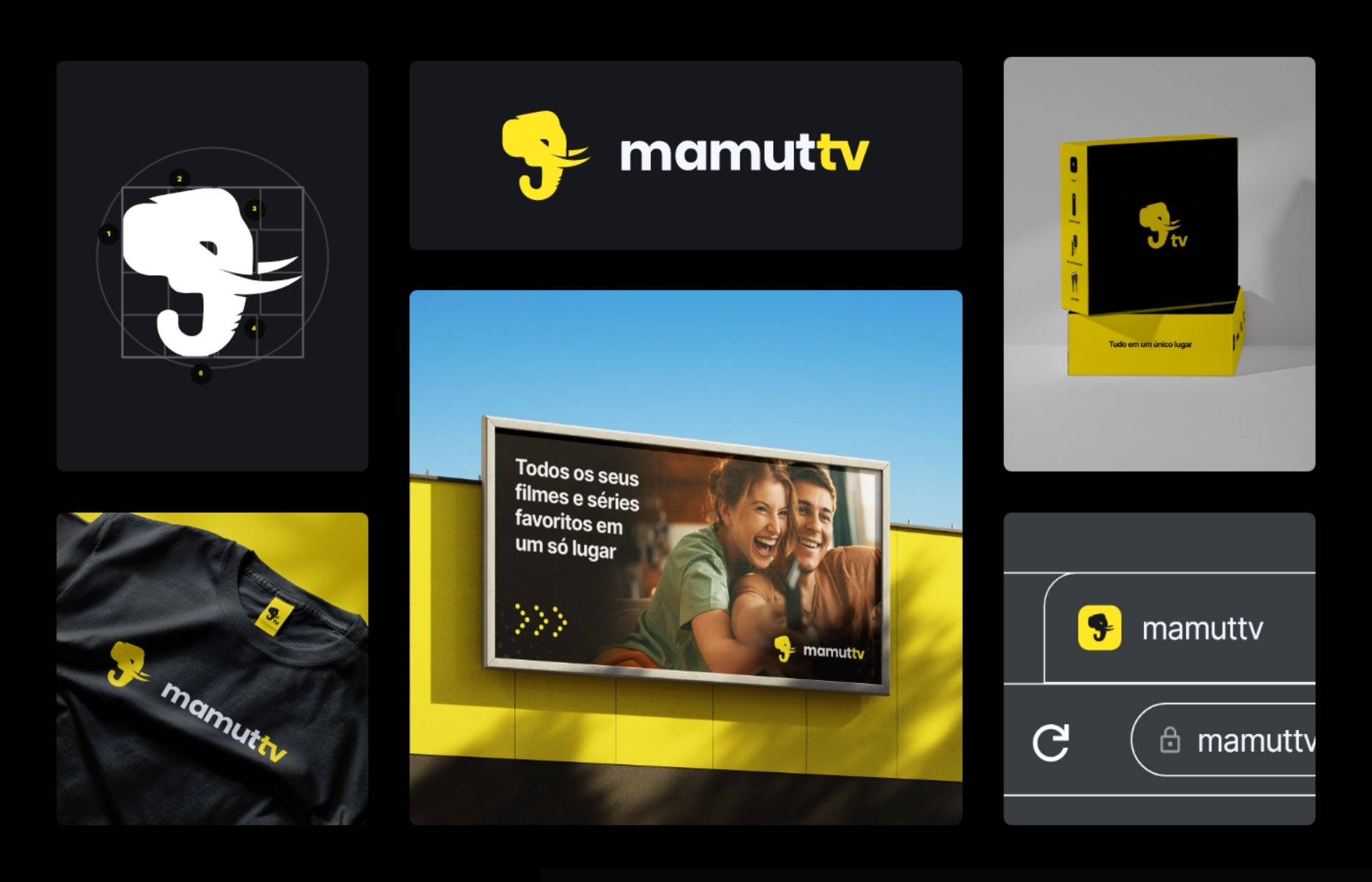
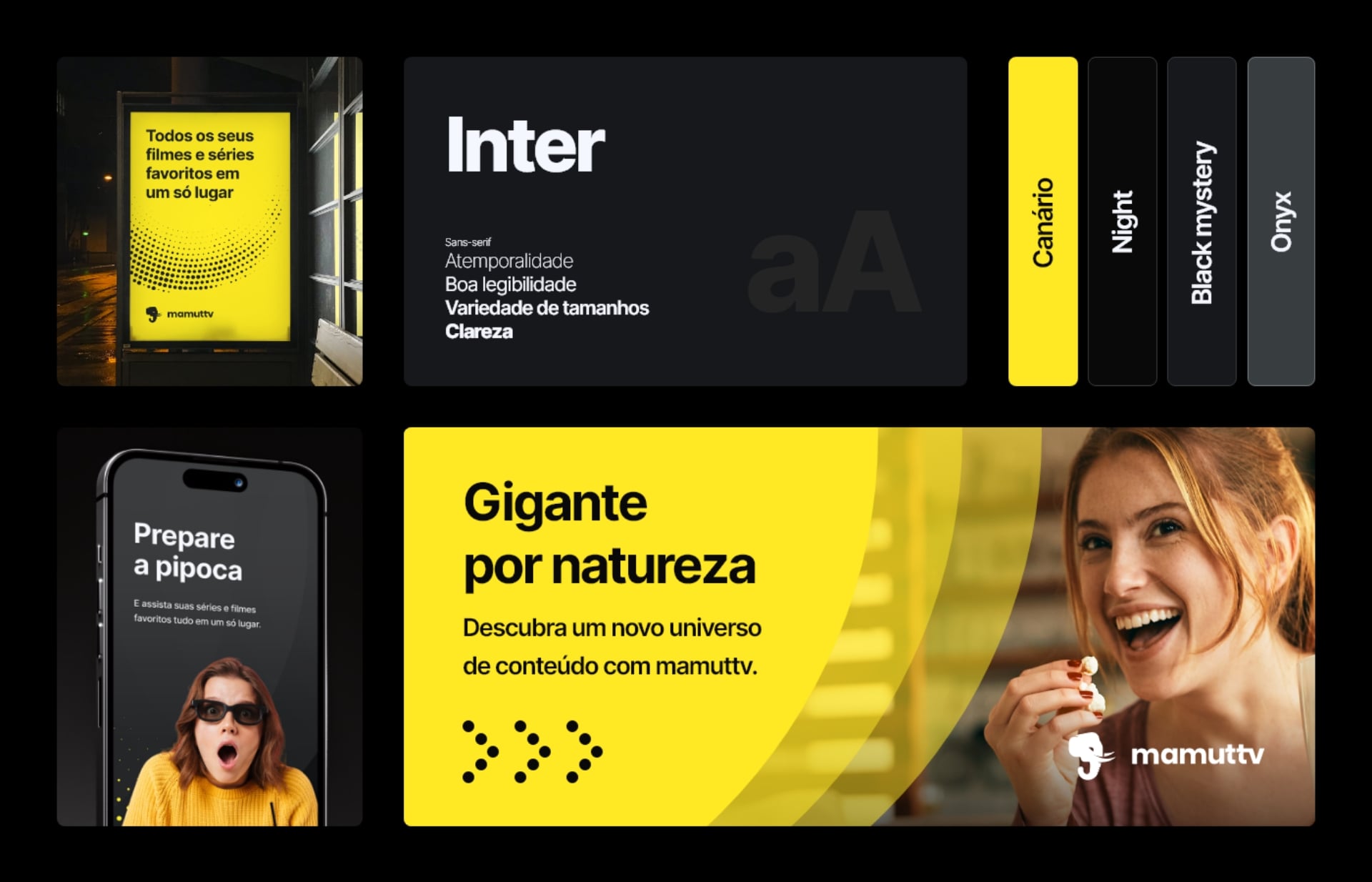
During the communications with the client, we mapped out the main values that the new brand should represent: being Robust, Modern and Intuitive. To present the final result, in addition to creating the logo, we showed the various applications, such as the color palette, graphic elements, gifts, advertising posters and the product packaging. This entire communication strategy helped to materialize the product that would be launched.

Another very important point was the decision regarding the colors used. The inspiration for the contrast between canary yellow (our brand's main color) and the black tones in the background sought to represent the opposition that exists between good and evil, weak and strong, hero and villain and all the antagonistic elements necessary to create a good narrative for the big screen. Just like in a movie session, where most of the room is plunged into darkness, the light comes to life through the screen!

UI and UX

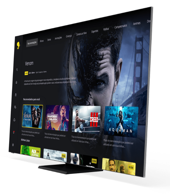
A good user interface (UI) must be intuitive and easy to use. Users should be able to easily find the content they want to watch and navigate through the platform without feeling lost or confused. The user experience (UX) must be pleasant and engaging, encouraging viewers to spend more time on the platform and return regularly.

Simplicity, ease and retention

When creating the platform, we carried out extensive benchmarking research on the various TV streaming channels and identified some improvements that were implemented in the project. By doing so, we sought to increase user retention within the app.

How can we help you?

Tell us about your project

Tell us about your project

where we are?

Brazil

Rua Pium-Í, 784 - 03 - Cruzeiro, 
Belo Horizonte - MG, 30310-080

Portugal

Av. Comendador Ferreira de Matos,
nº 682, Sala D, Porto

England

4-5 Bonhill St, Shoreditch,
London EC2A 4BX, United Kingdom
Criasol Digital Business 2023.

We use cookies to ensure you have the best experience on our website. If you have any doubt, please access our Privacy Policy.